Best Practices for Selecting Colors in Wood Carving Projects
Understanding the Wood's Natural Color and Grain
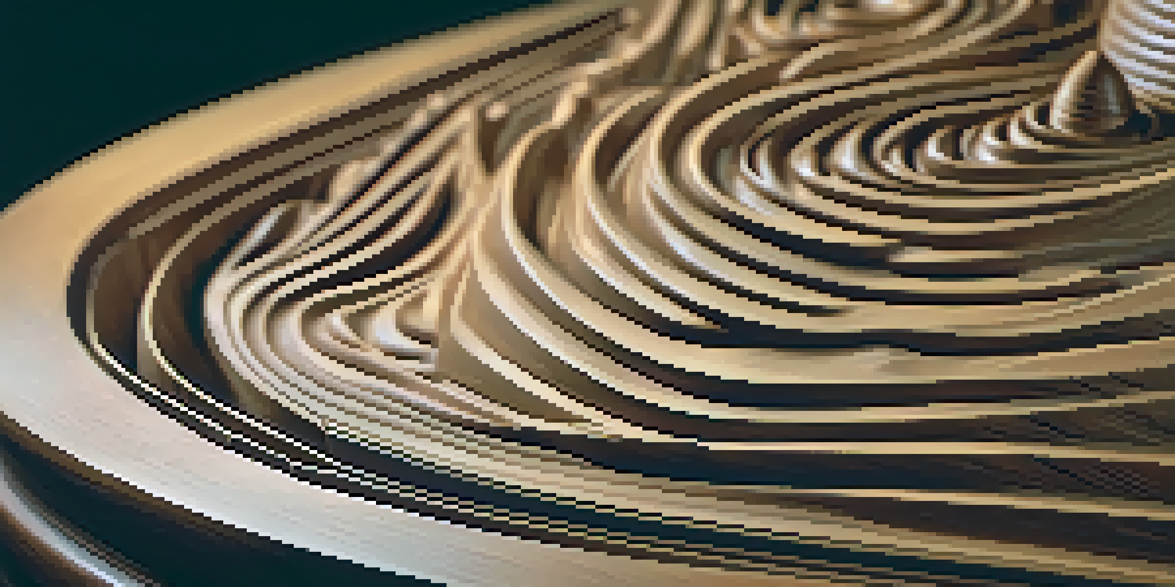
Before diving into color selection, it's crucial to recognize the natural hue and grain of the wood you're working with. Each type of wood carries its unique characteristics, which can dramatically influence the final look of your carving. For instance, oak has a warm, golden tone, while walnut presents a deep, rich color.
Color is the keyboard, the eyes are the harmonies, the soul is the piano with many strings.
The grain patterns also play a pivotal role in how colors will appear once applied. Certain woods, like pine, have a more uniform grain that can lend itself well to lighter stains, while others may showcase unique patterns that can either clash or complement your color choices.
Taking the time to appreciate these natural elements not only helps in selecting colors that enhance the wood's beauty but also ensures that your final piece feels cohesive and intentional.
Choosing a Color Palette that Resonates with Your Vision
A well-thought-out color palette can transform your wood carving from ordinary to extraordinary. Start by considering the mood or message you want to convey with your piece. For example, warm colors like reds and oranges can evoke feelings of warmth and comfort, while cooler colors like blues and greens can inspire calmness.
Utilizing color theory can help you create a harmonious palette. Complementary colors—those opposite each other on the color wheel—can create vibrant contrasts, while analogous colors—those next to each other—tend to create a more serene look.
Understand Wood's Color and Grain
Recognizing the natural color and grain of wood is essential for selecting colors that enhance its beauty and coherence.
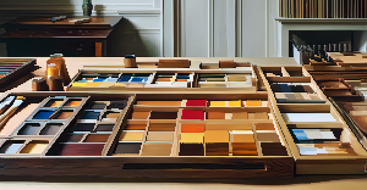
Don't hesitate to experiment! Create small samples on scrap wood to visualize how colors interact before committing to your final choices.
Testing Colors with Different Finishes
Understanding that the finish you choose can significantly alter the appearance of your selected colors is essential. A matte finish will absorb light differently than a glossy one, impacting the vibrancy and depth of your colors. Therefore, testing your color selections with various finishes is a smart practice.
The beauty of wood is in its grain, and the beauty of color is in its harmony.
Begin by applying color samples to a small piece of the same wood type, then try out different finishes. This step allows you to see how the wood grain interacts with your chosen color under different lighting conditions, enhancing your decision-making process.
By testing, you'll gain insights into how your colors and finishes work together, helping you avoid unpleasant surprises later in the project.
Considering the Scale and Size of Your Project
The scale of your wood carving significantly impacts your color choices. Larger pieces may benefit from bolder colors that can stand out from a distance, while smaller projects often call for more subtle hues that invite closer inspection. Consider how the colors will be perceived from various vantage points.
For example, a large outdoor sculpture might require brighter colors to capture attention, whereas a delicate jewelry box might shine with muted pastels or intricate details. Scale can also affect the use of contrast; larger areas can handle more significant contrasts without appearing chaotic.
Choose Colors for Your Project Size
The scale of your wood carving influences color choices, with larger pieces benefiting from bolder colors and smaller projects favoring subtler hues.
Ultimately, aligning your color strategy with the size of your project will enhance its overall visual appeal and effectiveness.
Utilizing Color to Highlight Details and Features
Colors can serve as powerful tools to accentuate specific features in your wood carving. By using contrasting colors, you can draw attention to intricate designs or textures, making them pop against the background. This technique is particularly effective in pieces with ornate carvings or layered designs.
Additionally, consider using a wash or glaze to softly tint certain areas while preserving the wood's natural beauty. This approach allows you to enhance details without overwhelming the viewer with color.
Strategic use of color to highlight details can transform your work from a simple carving into a captivating piece of art that engages viewers on multiple levels.
Creating a Cohesive Look with Background Colors
The background color of your carving project is often just as important as the colors used on the piece itself. A well-chosen background can either enhance or detract from the beauty of your carving, so consider how the two will interact. Neutral tones can allow your main colors to stand out, while textured backgrounds might add depth.
Experimenting with different backgrounds can also provide a fresh perspective on your color choices. For example, a vibrant carving might look striking against a muted background, whereas a more delicate piece might benefit from a subtle, complementary hue.
Seek Inspiration from Nature and Art
Drawing inspiration from nature and art can help you create a vibrant and organic color palette for your wood carving projects.
Ultimately, ensuring that your background color aligns with your overall vision will create a harmonious and impactful final piece.
Seeking Inspiration from Nature and Art
Nature is an incredible source of inspiration when it comes to selecting colors for wood carving projects. Observing the natural world around you—be it the colors of a sunset, the tones of a flower garden, or the hues of a forest—can spark fresh ideas and help you create a palette that feels organic and alive.
You can also look to art for inspiration. Visit galleries, browse online platforms, or even flip through magazines to see how artists utilize color. Note how different combinations evoke various emotions and how you can apply similar principles to your work.

By drawing from both nature and art, you'll enrich your creative process and discover unique color combinations that resonate with your personal style.
Final Tips for Effective Color Selection
As you finalize your color selections for wood carving projects, remember to trust your instincts. While guidelines and practices can steer you in the right direction, there's no substitute for your personal taste and creativity. If a color combination feels right to you, go for it!
Keep a color journal or swatch book to document your favorite combinations and ideas. This resource can serve as a valuable reference for future projects and help you develop a signature style over time.
Lastly, don't be afraid to make adjustments as you work. Sometimes the best results come from spontaneity, so allow yourself the freedom to explore and adapt your color choices.