Color Schemes: Creating Harmony in Carved Artworks
Understanding the Basics of Color Theory in Art
Color theory is the foundation of creating visually appealing artworks. It explains how colors interact and how they can be combined to evoke emotions. For carved artworks, understanding this theory helps artisans choose colors that not only complement the design but also enhance the overall impact of the piece.
Color is the keyboard, the eyes are the harmonies, the soul is the piano with many strings.
The color wheel is a useful tool in this regard, showcasing primary, secondary, and tertiary colors. Artists can use this wheel to identify which colors will create harmony or contrast. For example, pairing complementary colors, like blue and orange, can create a vibrant, eye-catching effect that draws viewers in.
Moreover, the psychological effects of color play a significant role in art. Different colors can evoke different feelings; for instance, blues may convey calmness, while reds can evoke passion. Carved artworks can leverage these emotional responses through thoughtful color choices to create a deeper connection with the audience.
The Importance of Color Harmony in Carved Artworks
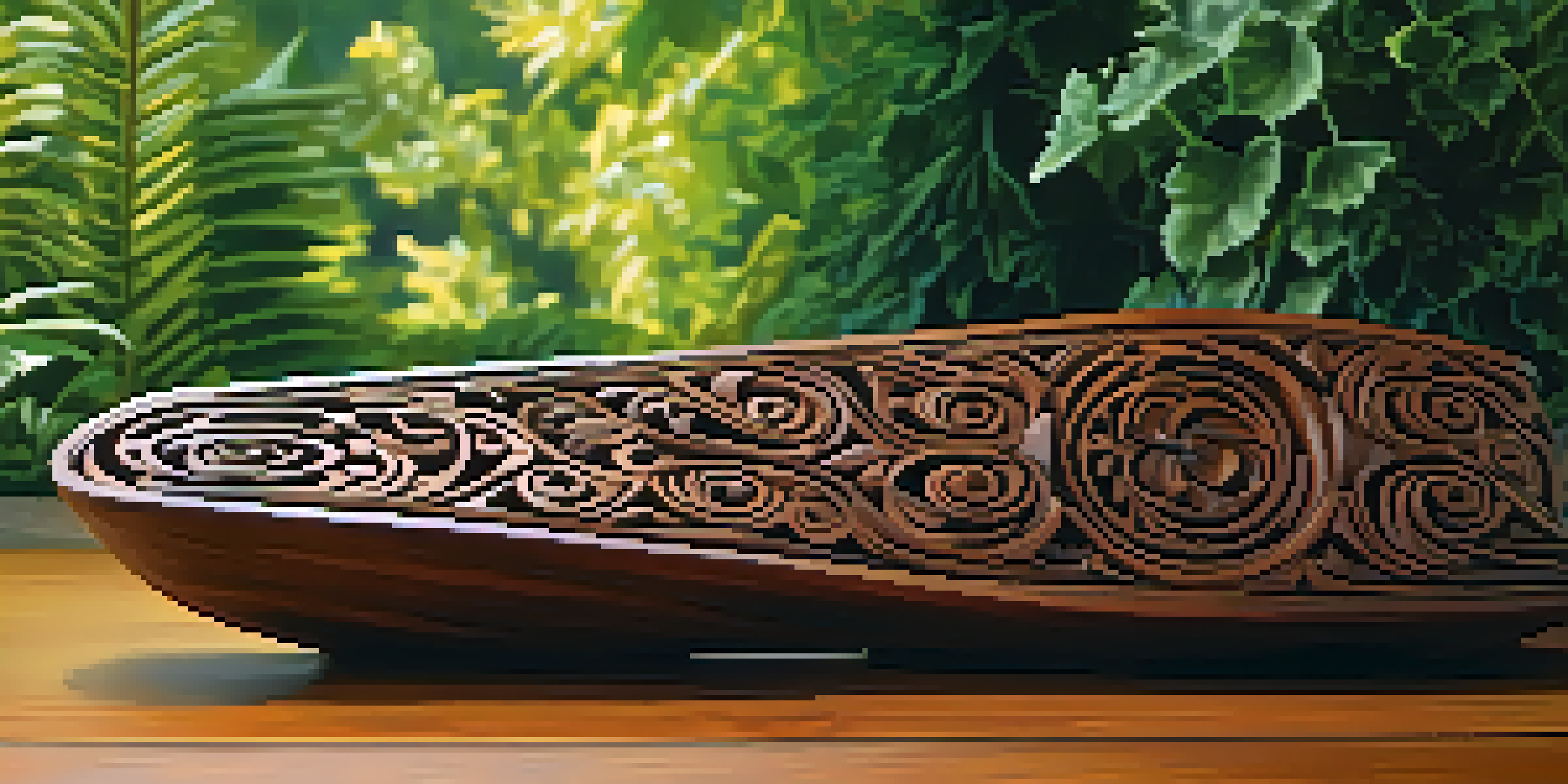
Color harmony refers to the aesthetically pleasing arrangement of colors. In carved artworks, achieving this harmony can elevate a piece from ordinary to extraordinary. When colors are harmonized, they create a sense of balance and unity that enhances the viewer's experience.
One practical approach to achieving color harmony is through analogous color schemes. These involve using colors that are next to each other on the color wheel, such as green, yellow-green, and yellow. This subtle blending can result in a serene and cohesive look that works beautifully in carvings.
Color Theory Enhances Art Appeal
Understanding color theory helps artists choose colors that evoke emotions and enhance the impact of their carved artworks.
In contrast, a monochromatic color scheme, which involves different shades of a single color, can also be effective. This approach can bring depth and dimension to carved artworks while maintaining a consistent and harmonious feel throughout the piece.
Choosing a Color Palette: Tips and Techniques
Choosing the right color palette is crucial for any carved artwork. A well-thought-out palette can enhance the theme and message of the piece. Start by considering the mood you want to convey, as this will guide your color choices.
Colors are the smiles of nature.
One effective technique is to create a mood board filled with colors that resonate with your vision. This visual reference can help you see how different shades work together. Additionally, experimenting with various combinations can lead to unexpected yet stunning results.
Don’t forget to account for the material of your carved artwork. Different materials can absorb and reflect colors differently, affecting the final look. Testing your chosen colors on a small sample can help ensure that your palette translates well onto the actual piece.
The Role of Light in Perception of Color
Light plays a pivotal role in how colors are perceived in any artwork, including carved pieces. Different lighting conditions can dramatically alter the appearance of colors. For instance, natural light can bring out the vibrancy in hues, while artificial light may soften them.
Understanding the environment where your artwork will be displayed is essential. Will it be in a well-lit room or a dimly lit gallery? This knowledge can help you select colors that will look their best under those specific conditions.
Color Harmony Elevates Artworks
Achieving color harmony through schemes like analogous or monochromatic can transform a piece from ordinary to extraordinary.
Moreover, experimenting with different lighting setups during creation can provide insights into how your colors interact. Observing your carved piece in various lights can inform adjustments to your color choices, ensuring the final product shines in any setting.
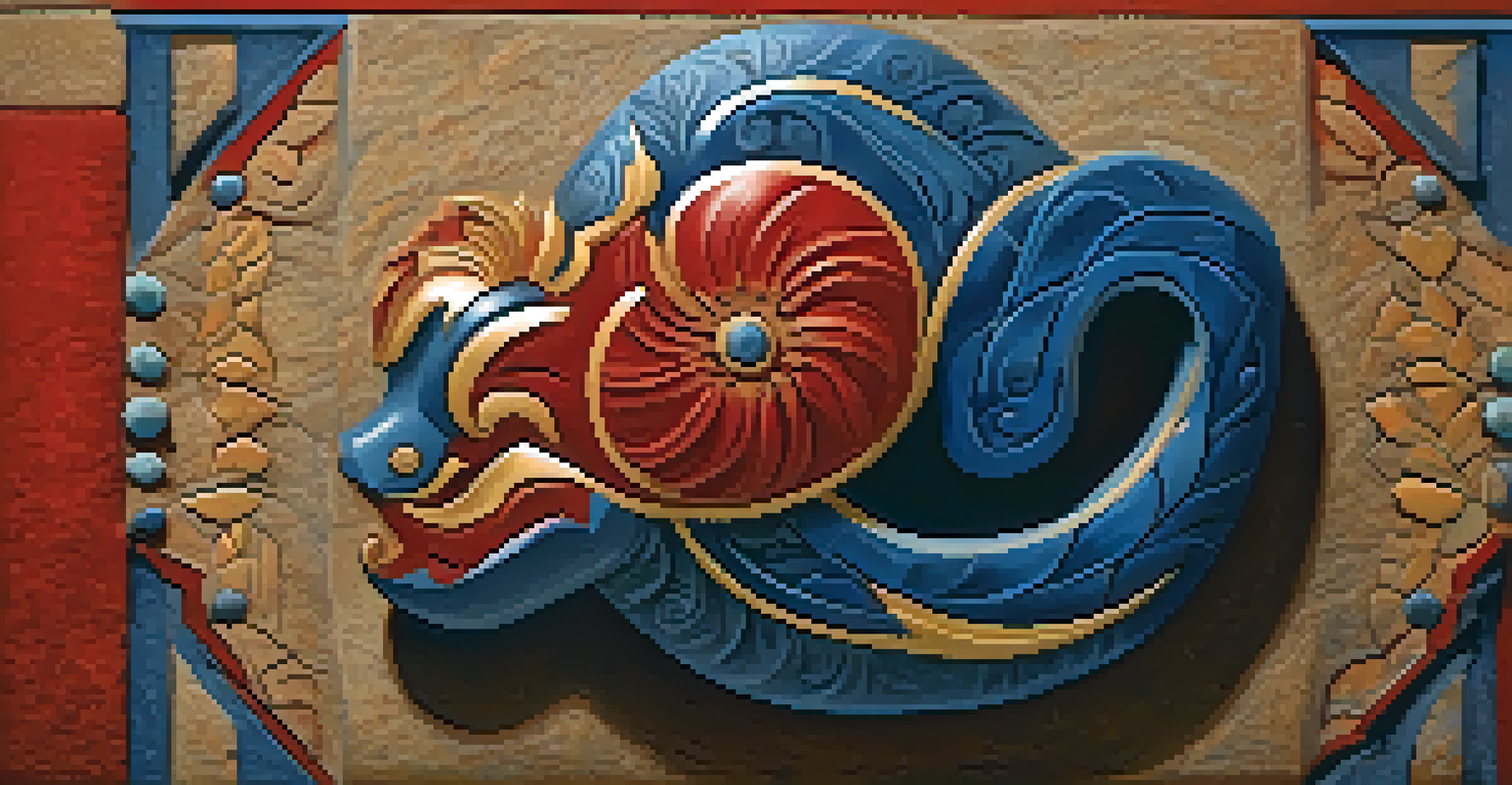
Cultural Significance of Colors in Carved Art
Colors carry different meanings across cultures, and this significance can be particularly important in carved artworks. For example, red is often associated with luck in many Asian cultures, while in Western contexts, it may symbolize love or passion. Being aware of these cultural nuances can add depth to your work.
Incorporating culturally significant colors can resonate more profoundly with viewers, allowing them to connect on a personal level. This connection can enhance the storytelling aspect of your carved art, making it not just visually appealing but also meaningful.
Additionally, researching the cultural history behind certain colors can inspire your designs and color choices. This exploration can lead to a richer narrative within your artwork, drawing the audience into a more immersive experience.
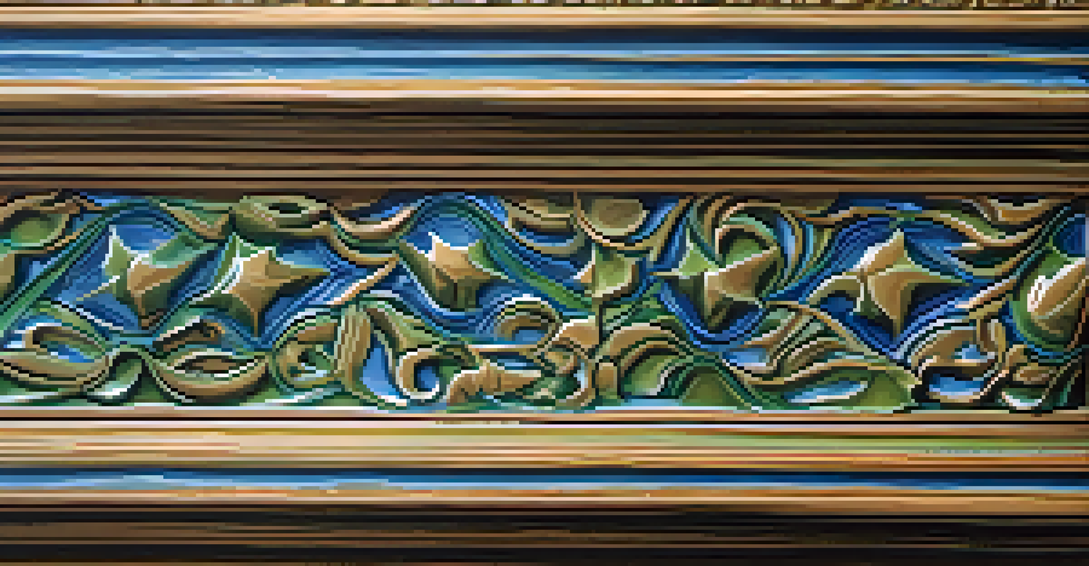
Experimenting with Textures and Finishes
Textures and finishes can significantly impact how colors are perceived in carved artworks. A glossy finish can make colors appear brighter and more vibrant, while a matte finish might lend a more subdued look. Experimenting with these elements can yield fascinating results in your creations.
Incorporating different textures can also add depth and interest to your piece. For example, combining smooth and rough surfaces can create dynamic contrasts that enhance the visual appeal. These contrasts can draw the eye and invite viewers to engage more closely with the work.
Lighting Affects Color Perception
Different lighting conditions can dramatically alter how colors appear, making it essential to consider the display environment when choosing colors.
Consider how your choice of finish can complement your color palette. A textured surface may enrich the colors’ appearance, making them pop or appear softer depending on the effects you aim to achieve. Testing various combinations can lead to unique and striking outcomes.
Final Thoughts: Mastering Color in Carved Artworks
Mastering color schemes in carved artworks is both an art and a science. It requires an understanding of color theory, the impact of light, and cultural significance, all while maintaining your unique artistic voice. The journey to finding the perfect color palette can be both challenging and rewarding.
Don’t hesitate to experiment and embrace trial and error. Some of the most stunning artworks come from unexpected color combinations and innovative approaches. Allow yourself the freedom to explore different palettes and finishes until you find what resonates with your vision.
Ultimately, the goal is to create harmony through color that captivates and connects with your audience. By focusing on the principles discussed, you can elevate your carved artworks and leave a lasting impression on viewers.