Understanding Color Theory for Effective Carving Techniques
What is Color Theory and Why It Matters for Carving?
Color theory is the study of how colors interact with one another and how they can be combined to create harmony or contrast. For carving, understanding color can enhance the aesthetic appeal of your work. When you choose colors wisely, you can evoke emotions, highlight features, and guide viewers' attention.
Color is the keyboard, the eyes are the harmonies, the soul is the piano with many strings.
Just like a painter uses color to evoke feelings, a carver can use color in their materials, finishes, and designs to create a deeper connection with the audience. This can transform a simple piece into a striking work of art. Knowing the basics of color theory is essential for any carving artist looking to elevate their craft.
Moreover, understanding color relationships, such as complementary and analogous colors, can help you make informed decisions about your materials. Whether you’re choosing wood stains or paints, applying color theory can lead to more dynamic creations.
The Color Wheel: Your Essential Tool
At the heart of color theory is the color wheel, a circular diagram that showcases the relationship between primary, secondary, and tertiary colors. This tool is invaluable for carvers because it visually represents how colors can complement or contrast with one another. By familiarizing yourself with the color wheel, you can make better choices in your projects.
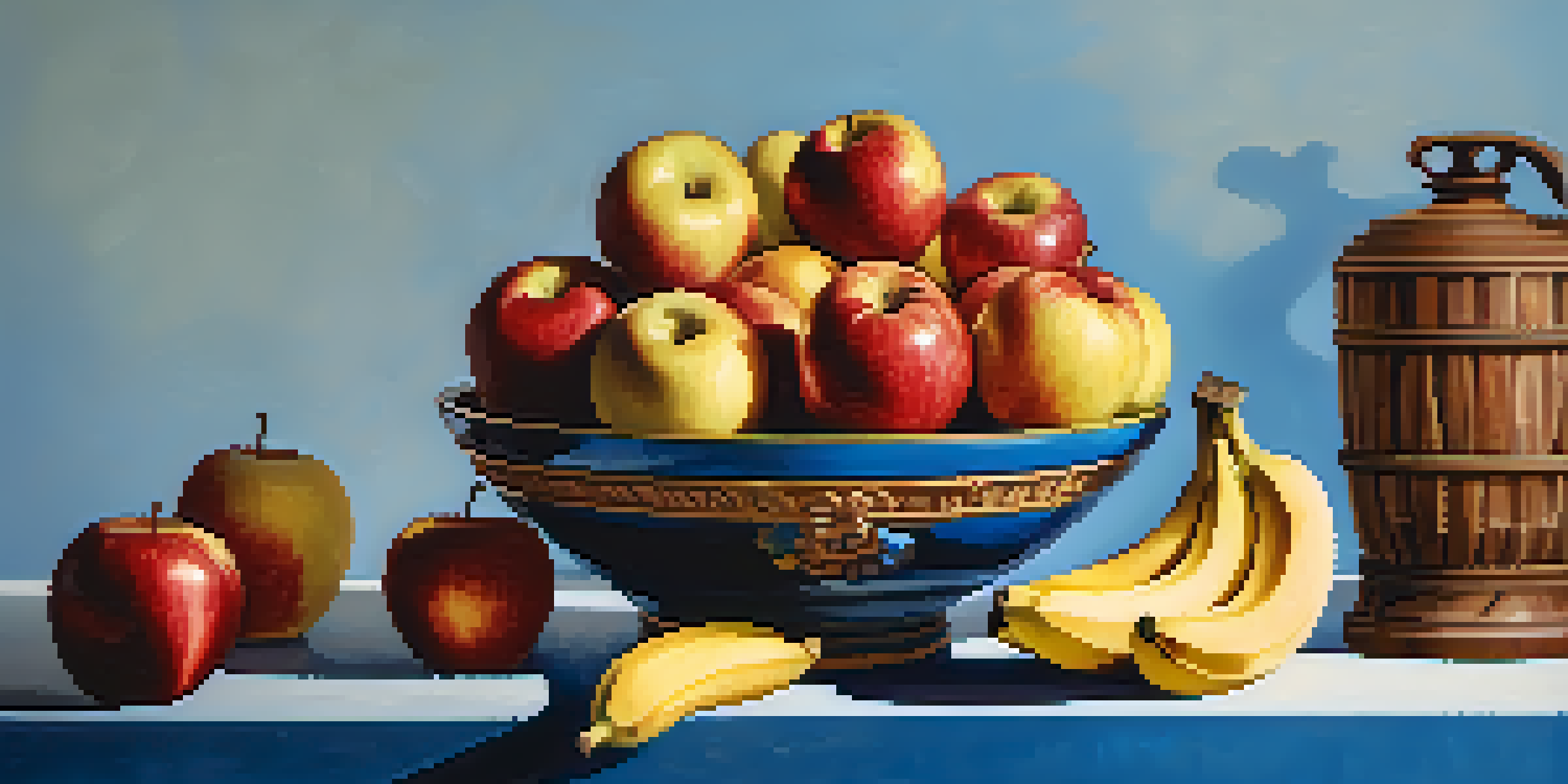
For instance, if you’re carving a piece featuring warm tones like reds and yellows, you might want to pair them with cooler tones like blues or greens to create balance. This can make your work more visually appealing and interesting. Understanding these relationships can greatly impact how your carving is perceived.
Understanding Color Theory's Impact
Color theory enhances the aesthetic appeal of carvings by guiding emotional responses and drawing attention to features.
Additionally, the color wheel can help you experiment with color combinations. Try using a triadic scheme, which involves three colors that are evenly spaced on the wheel, to bring vibrancy and energy to your designs.
Understanding Warm and Cool Colors
Colors are often categorized into warm and cool tones. Warm colors, such as red, orange, and yellow, are associated with energy and excitement, while cool colors like blue, green, and purple evoke calmness and serenity. Recognizing these categories can help you convey specific emotions through your carving.
Colors are the smiles of nature.
For instance, if you’re creating a piece meant to inspire tranquility, incorporating cool colors can enhance that feeling. Conversely, if you want to evoke passion or excitement, warm colors can do the trick. Balancing these tones can lead to a more engaging piece.
When working on your carving, think about the emotional response you want to elicit. By consciously choosing between warm and cool colors, you can create a more intentional and impactful art piece.
The Importance of Contrast in Carving
Contrast is a fundamental concept in color theory, referring to the difference between colors and how they stand out against each other. In carving, using contrast effectively can draw attention to specific details or features of your work. It’s like having a spotlight on the elements you want to highlight.
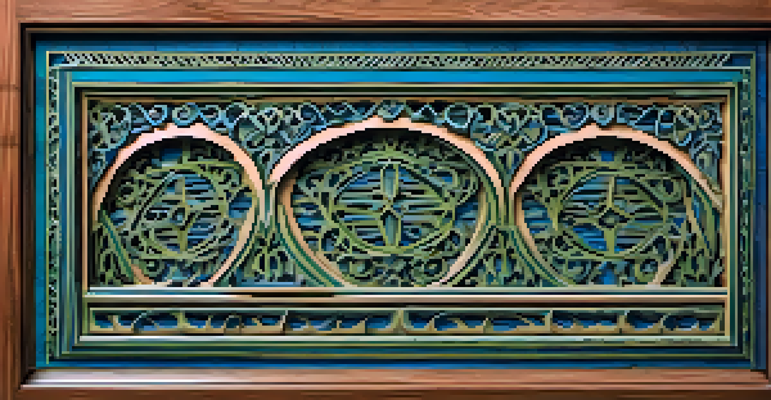
For example, if your carving features intricate patterns, using a darker stain on the background can make the lighter patterns pop. This not only enhances the visual appeal but also adds depth to your piece. Understanding how to play with light and dark can significantly improve your carvings.
Color Harmony for Cohesion
Achieving color harmony through analogous colors creates a balanced and inviting artwork, making it look polished.
Additionally, contrast can also refer to the texture and finish of your wood. A glossy finish on a carved element against a matte background can create a striking visual effect, making your work stand out even more.
Color Harmony: Creating Cohesion in Your Work
Color harmony refers to the pleasing arrangement of colors in a piece. Achieving harmony in your carvings can create a sense of balance and unity. This is crucial for making your artwork look polished and intentional, rather than chaotic or jarring.
One way to achieve color harmony is through the use of analogous colors, which are next to each other on the color wheel. For instance, a combination of blue, blue-green, and green can create a soothing effect that feels cohesive and inviting.
Experimenting with different color harmonies can lead to unique and creative outcomes. Don’t be afraid to play around with various combinations until you find one that resonates with your artistic vision.
Using Color Psychology in Your Carving
Color psychology explores how colors affect human behavior and emotions. As a carver, understanding the psychological impact of colors can help you tailor your work to evoke specific feelings. For example, blue often symbolizes trust and calm, while red can represent passion or urgency.
By selecting colors that align with the message or theme of your carving, you can create a more meaningful connection with your audience. This can be especially important in thematic or narrative pieces, where the story can be enhanced through your color choices.
Practical Application of Color Theory
Experimenting with color combinations and seeking inspiration can help carvers intuitively apply color theory to their work.
Consider the emotions you want your audience to feel. A well-thought-out color scheme can elevate your carving from a mere object to a vessel of emotion and storytelling.
Practical Tips for Applying Color Theory in Carving
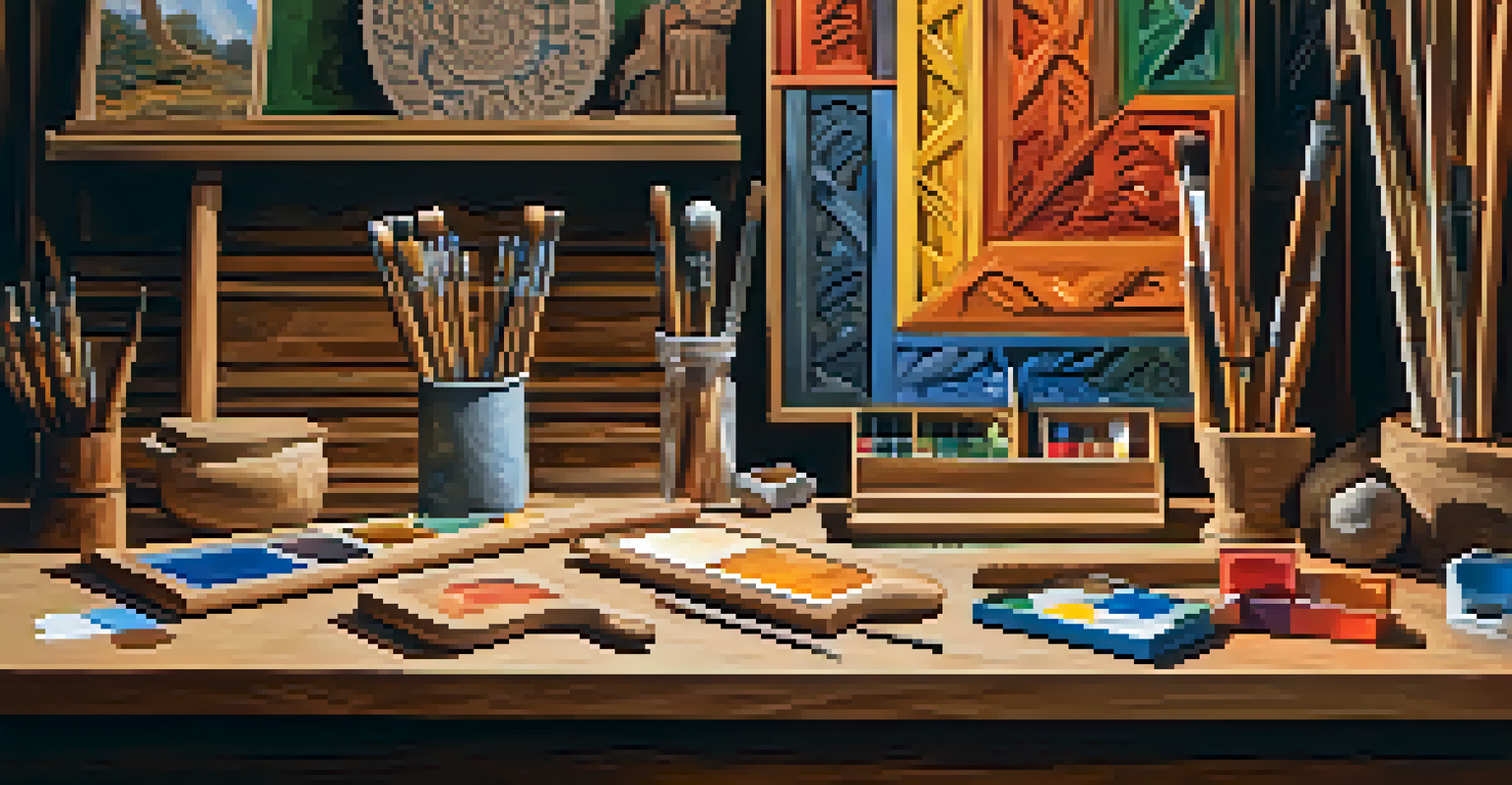
Now that you understand the principles of color theory, how can you apply this knowledge to your carving? Start by experimenting with different color combinations on small test pieces. This will allow you to see how colors interact before committing to a larger project.
Also, don’t hesitate to seek inspiration from nature or art. Observing how colors work together in the environment can spark ideas for your own work. Keep a sketchbook or color palette handy to jot down combinations that catch your eye.
Finally, remember that practice makes perfect. The more you play with color in your carvings, the more intuitive it will become. Trust your instincts and have fun with the process!